For my Media Coursework of creating a music magazine, I used, developed and challenged many forms and conventions; of existing music magazines, such as VIBE and XXL! The conventions of a magazine are: the title, central image, magazine slogan, anchorage (supporting) text, 3/ 4 colours scheme, buzz words, puffs, teasers and graphic features, Barcode, Date and the common Magazine Price of £3.50, positioned at the bottom right-hand corner.
My target audience is young adults aged 17 – 21, as young adults have more common knowledge of music due to it being an aspect of teenage life. Gender is not a necessary factor as I planned my magazine to be a unisex magazine and neither is race or social class. However, I would suggest that my magazine audience is middle class as they see music as more of an outlet, a release from life and its stresses. From my results I concluded that most young adults listen to a variety of Hip-Hop/ RnB music and that they take a higher interest in a music magazine if it covers an array of sections such as, signed artists, artists photo shoots, interviews and the latest information on albums, relationships, successes and even failures.
1. To attract my target audience, I based my magazine on what my target audience likes. I produced a questionnaire to get an insight of what young adults/ teenagers are interested in.
*I based my magazine on RnB but I also include Hip Hop music genre in it to extend
*The main image both attracts and addresses my target audience; it is of a young attractive (natural; I airbrushed her at some points) female so that the audience no matter what gender the reader is they can buy it. The image follows the convention as the front cover image is a medium close up, which most hip –hop magazines use in order to show face expression, the body language of the image portrays a ‘bad’ attitude which is something that most females on cover pages portray.
*The person on the front cover is a female who goes to the college and is female, this will attract the male audience more particularly those who attend college as they lie in the same age group. The wardrobe management and direction was done by the photographer (me) I asked her to put on a white and black top because I believed it will make my cover very simple but effective.
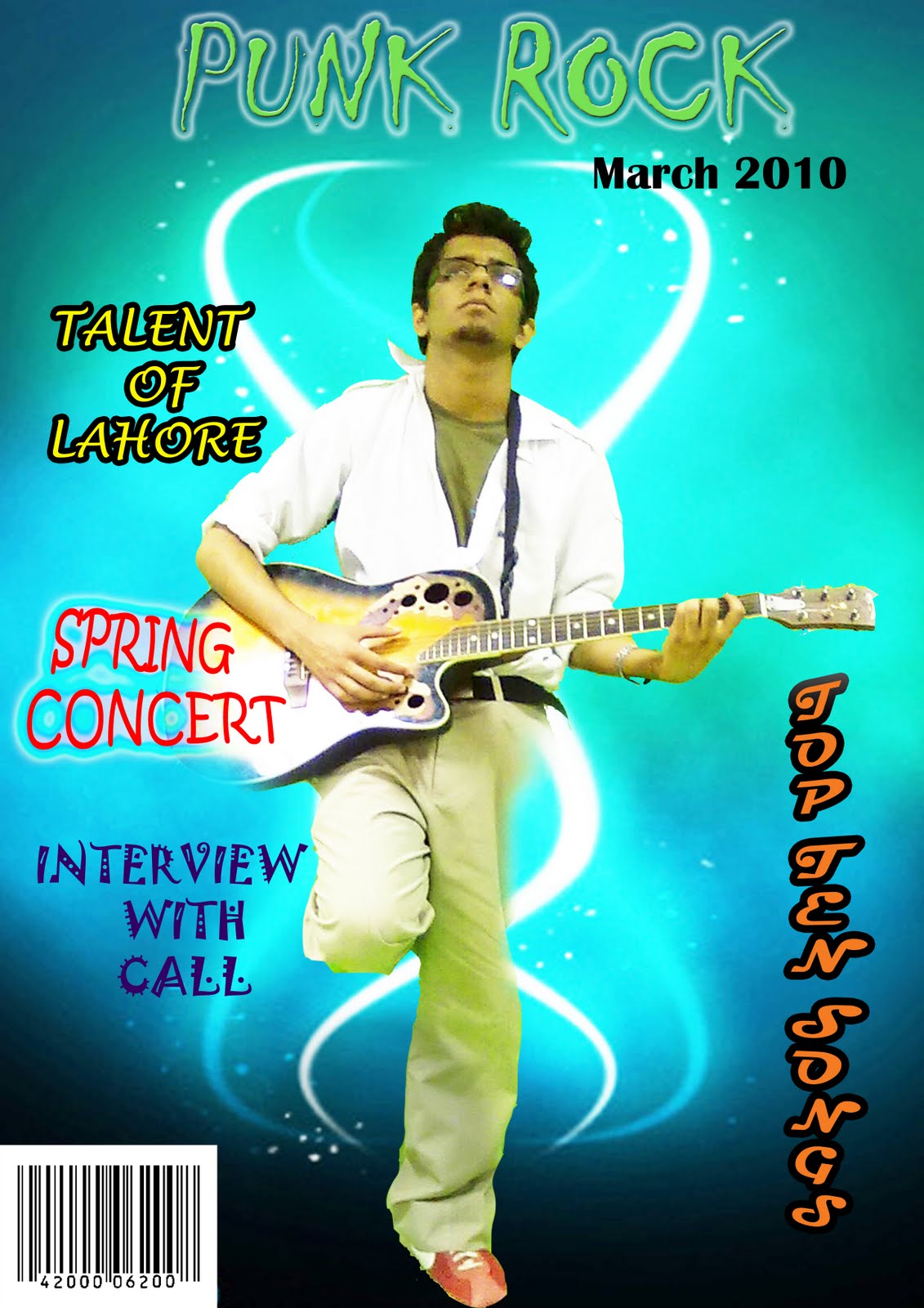
*The audience is represented by the male on the front cover as he is a young lad ( who falls into the age criteria of the target audience)
2. * My target audience would get instantly get attracted by the front page of the magazine as females attracted are by hot males hence why there is a male on the front cover of my magazine. The target audience should be listening to RnB/hip-hop and into the RnB/hip-hop culture so they will recognise the names on the front covers and will be lured into reading the content of the article.
I have learnt how to use Photoshop and Illustrator effectively and efficiently; I can now easily use the tools on both of these programmes.
*I know how to edit pictures on Photoshop and create documents on Illustrator to an acceptable even a good standard.
*I have also learnt how to use a digital camera for my own personal gain and to correctly take reasonably good pictures for my magazine.
*I have also learnt how to create a blog (on blogspot.com), how to upload images and my work onto it, add friends.
*Also I have learnt that in the media industry, technology is used to change images to the way the person or company deem acceptable which can change people’s perceptions and opinions of what is right; they also use airbrushing in Photoshop to alter people's appearances.
*I know how to use the spot healing tool to make the models face appear smoother.
*I have learnt how to make the image blend with or stand out from the background with the use of 'blur' effect around the edges or an outer glow.
*Learnt how to use of the magic wand.
I understand the importance of research and using questionnaires to find out what my audience wants to see in the magazine and what must be included.
*I have learnt different technical media language that are better suited to describe my work; words and phrases such as connotation, denotation, direct mode of address, sell lines and puff.
*I have learnt the importance of using mid-shot, clear images with suitable lighting.
*I understand the importance and effect of subheadings and synopsis. I have learnt how to organise the additional images more sufficiently.
*I know the importance of using a large, colourful masthead in order to attract attention.
*I have learnt how to lighten the image if it is too dark.
*I have learnt different technical media language that are better suited to describe my work; words and phrases such as connotation, denotation, direct mode of address, sell lines and puff.
*Also I have learnt that in the media industry, technology is used to change images to the way the person or company deem acceptable which can change people’s perceptions and opinions of what is right; they also use airbrushing in Photoshop to alter people's appearances so they get a perfect image.
1. My music magazine verifies and develops the conventions of real music magazines. I researched magazines of the same and different genres to become familiar with their presentational deceives so I could transfer the devices onto my magazine.
*My magazine a uses similar language devices such as superlatives to engage the reader and make the magazine unique and interesting.
*I used bright bold colours that are eye-catching for my audience.
o I have used similar ideas to used in XXL or Vibe.
o The models i have used throughout my magazine are dressed casually rather than formal ware as I wanted them to feel com and also attract the younger audience as they would relate to them and be inspired to copy the artists style. I would also like to add, I dressed them quite casually to make them look more ordinary so the audience can be inspired.
1. Seeing as I got no response or feedback to my magazine and it’s contents on my blog,
I decided to print off my magazine and to hand it out to a selected few who fit my target
audience profile and asked them to give me a personal response and feedback so I know
where to improve for future references.
Positive responses:
My audience liked my style and layout of the front cover and found it enticing with
its unique effects. I received a positive response to my contents page layout and
complimented on it’s uniqueness as I haven’t kept to the usual convention of
keeping to the left-hand side. The interview (my double page spread) was favoured
the most and I was complimented on the use of pictures and the film strip of pictures.
They said it was really unique and effective. The layout was easy to follow and the
Questions were easy to follow and the use of vocabulary was used very well.
Negative responses:
Luckily for me there were petty criticisms so not taken into consideration as much.
Respondents commented about the colours and asking why I hadn't used conventional
Colours such as black , red and blur but when I explained to them why I broke the
conventions they liked it because it was different.
Overall, 9/10 said they would purchase my magazine.